kissa sima sima(喫茶島々)
kissa sima sima by Go Uchida
“kissa sima sima” is a cafe which were opened at Matsumoto-city in Japan in April 2013 by a wonderful married couple. I designed a symbol mark and a typeface and a shop card of this cafe.
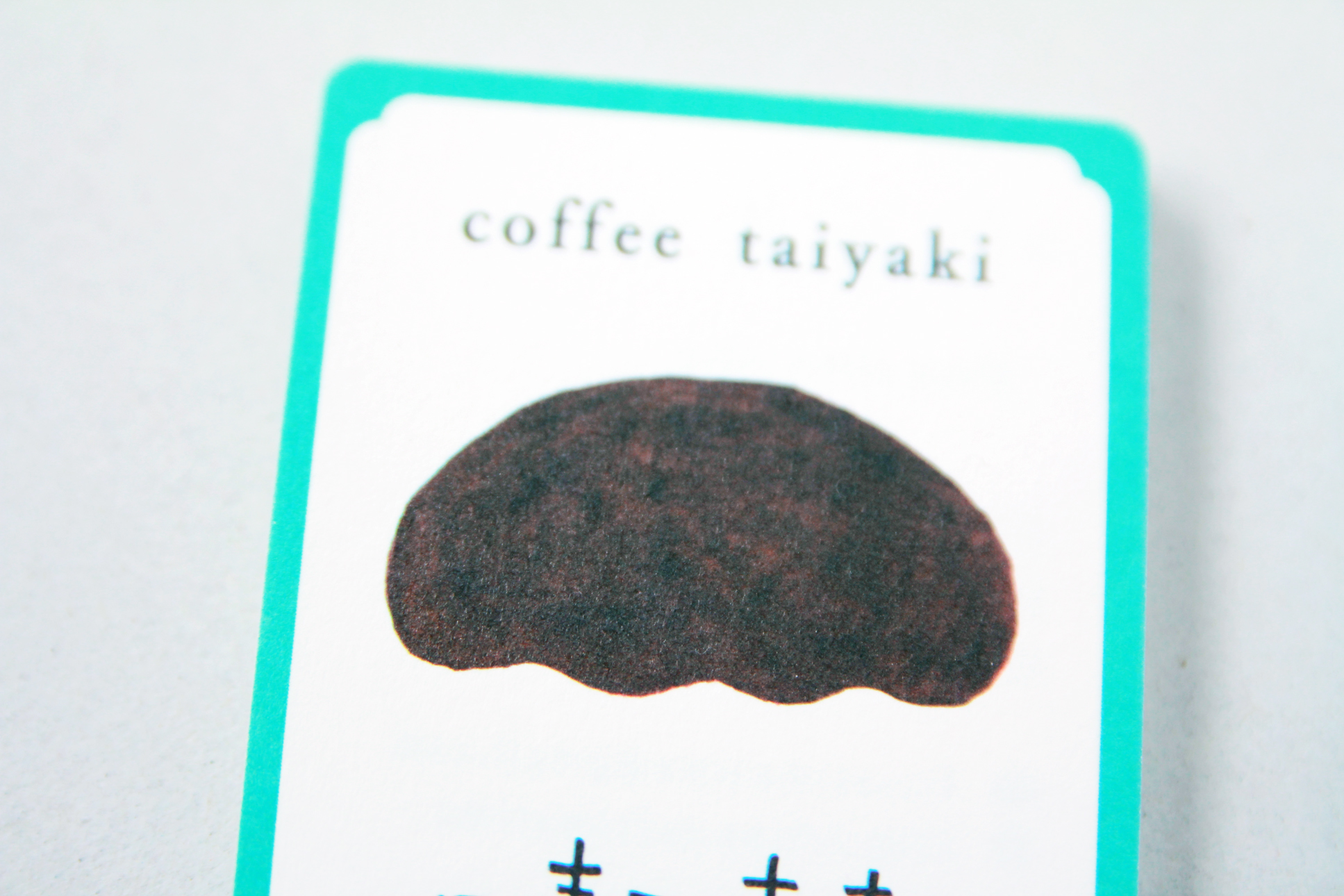
This symbol mark expresses a shape of island and red bean jam because the part of the name “sima” means island in Japanese language and the main menu of this cafe is Taiyaki – the taste of red bean jam is very important as this Japanese sweet.
This typeface comes from the personality of the owners. When I designed it, I wanted to express comfortable moods in this typeface because the owners were very kind and peaceful couple.