wazawaza
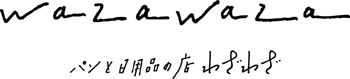
長野県東御市にある、パンと日用品の店「わざわざ」のロゴをデザイン。
Designed the logo of “wazawaza” which handles bread baked in an firewood oven and daily necessaries in Tomi-shi, Nagano.

The store of bread and daily necessaries
“wazawaza”
2015
2015
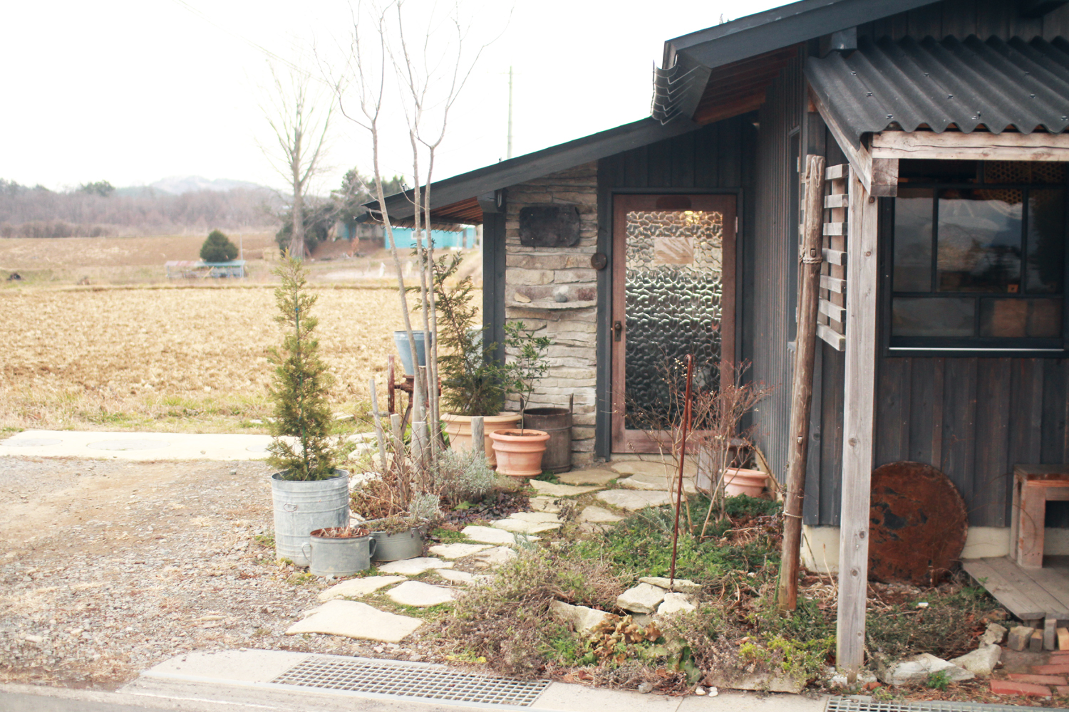
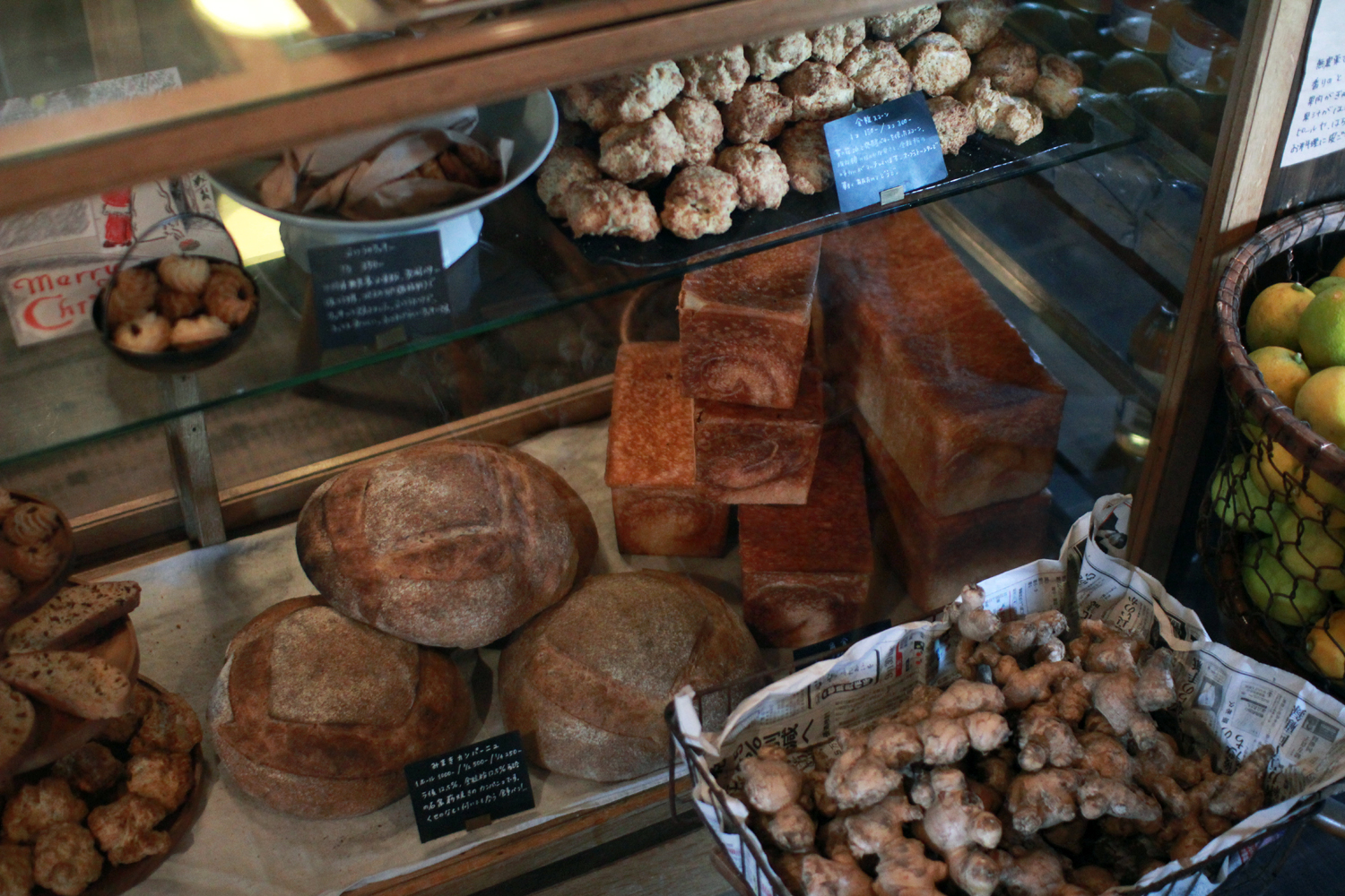
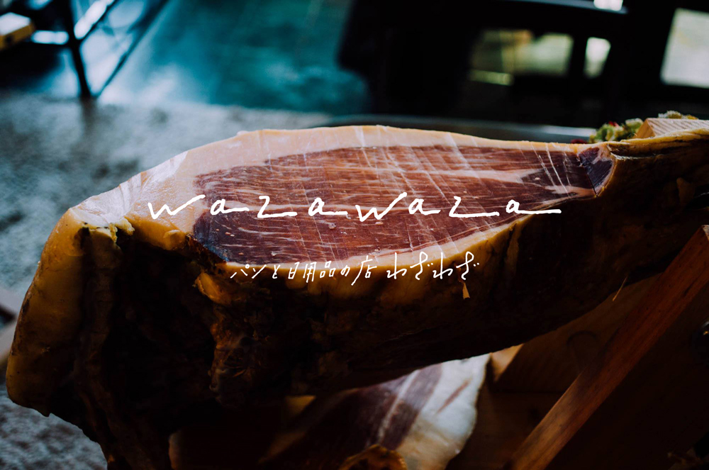
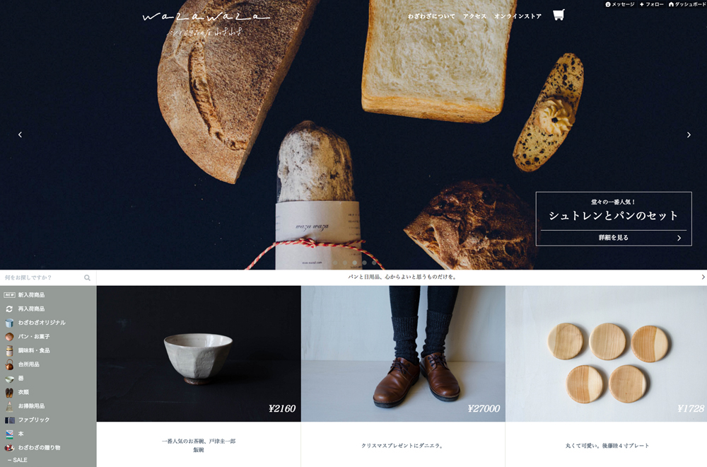
The store of bread and daily necessaries “wazawaza” is in Tomi-shi, Nagano. People can not go to this store as they pass by because it stands on a slightly high hill—as its name suggests. The name has two messages. One is their gratitude that customers come such a long way, and the other is their aim that they become a store worth going out of one’s way to go to the store.
パンと日用品の店「わざわざ」は、長野県東御市の小高い山の上にある。その名の通り、通りすがりで立ち寄ることはまず不可能な、わざわざ行かねばならない場所にある。そんな場所までわざわざ来てくださった客への感謝の気持ちと、そうまでしてわざわざ来る価値のある店になるという思いが、店名には込められている。
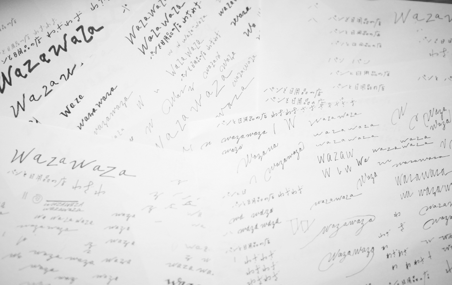
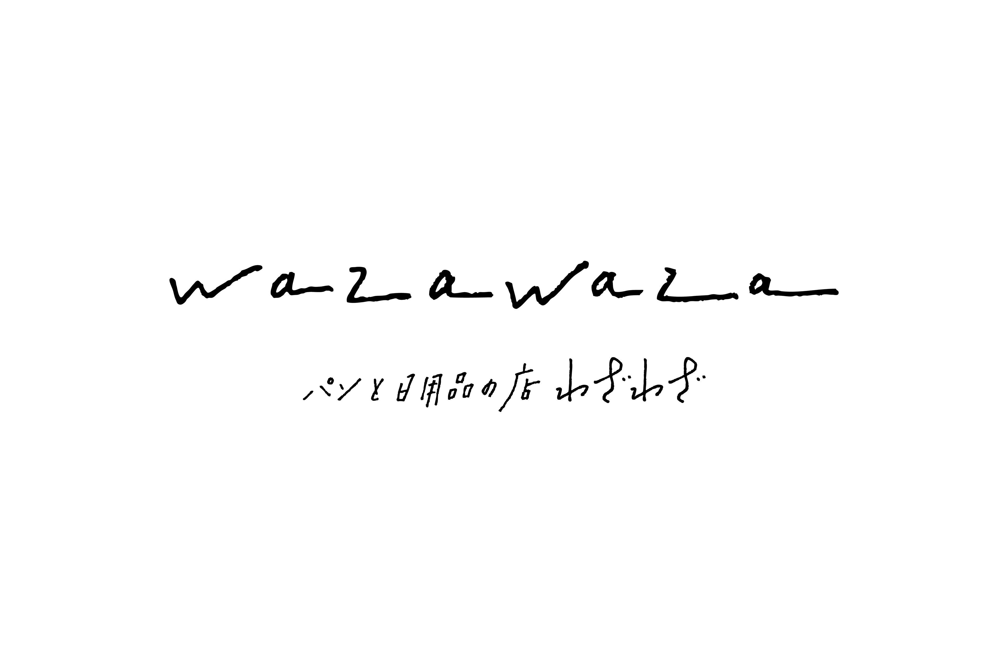
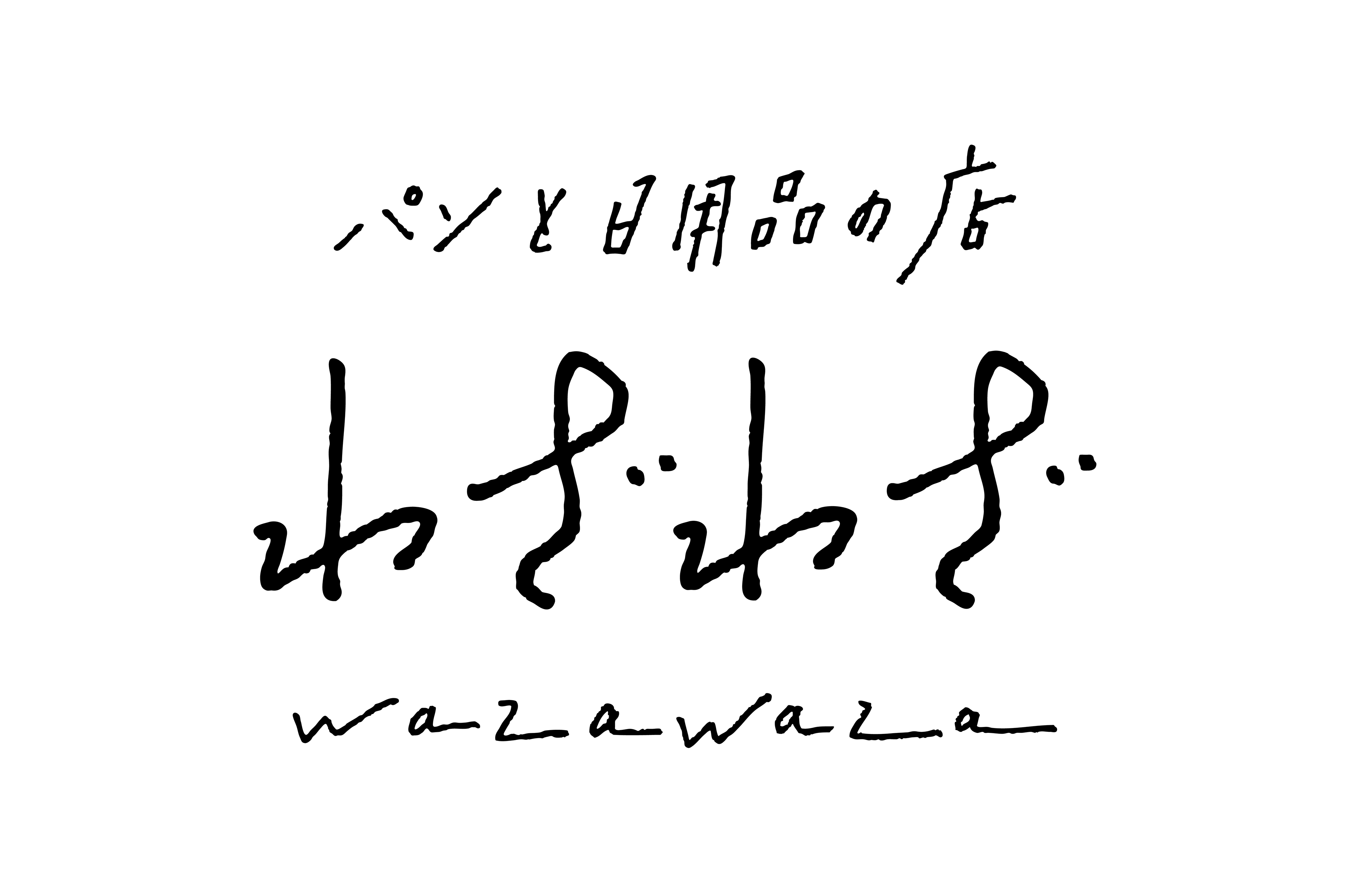
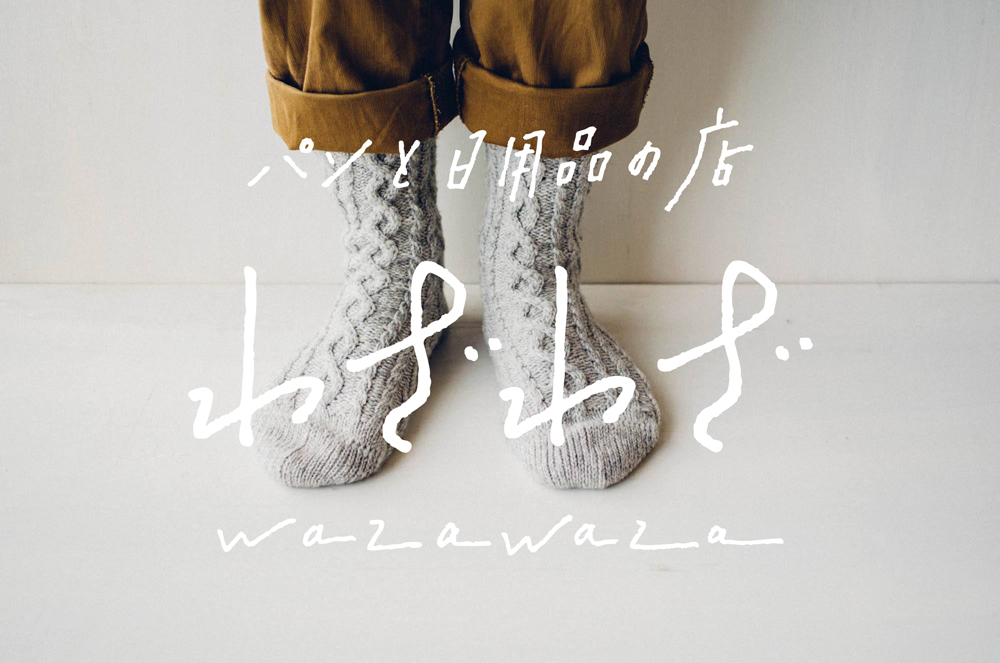
They had not had their official logo since the store opening, but they took the opportunity of renewing the web site to have it. At first, they hoped the logo by only hand-drawn letters.
開店以来決まったロゴがなかったが、2015年のウェブサイトリニューアルをきっかけに公式ロゴの制作を決めた。イラストは使わず、手書きの活字のみで構成したロゴを希望された。
in English
in Japanese
And also they wanted the logo expressing their own attitudes that they want to be honest with all—from making breads to work style and life. It is not easy to express such an abstract concept by only hand-drawn letter. Me and the owner of “wazawaza” looked for the most suitable letters and the most beautiful logo for expressing the attitude after I drew a lot of letters again and again.
求められたのは、パン屋のデザインとしてはよく見られる「素材感」や「温もり」をもとにしたロゴではなく、パン作りから暮らしかた・働きかたに至るまで、すべてに対し素直かつ正直にありたいというシンプルで誠実な姿勢を表現したロゴ。具体的なモチーフではなく、姿勢や態度といったあり方を、活字だけでデザインすることは、易しくない。店主とデザイナーの感覚が絶妙に合うところまで、何度も、また多くの活字を書くことで、最も適した、あるべき活字、美しいロゴを探した。
example of using logo
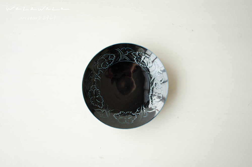
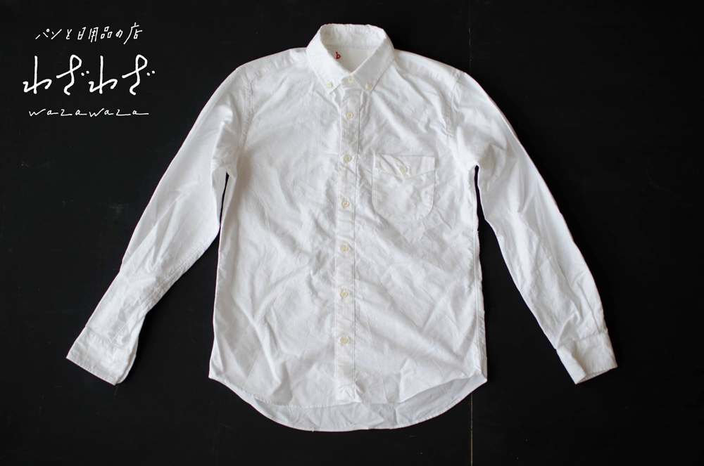
on web site
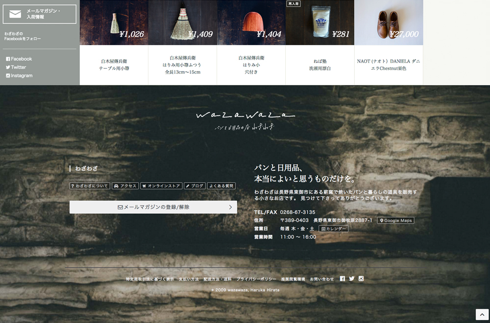
2887-1 Omakihara Tomi-shi Nagano 389-0403 Japan
Opens on Thursday, Friday, Saturday
11.00 am — 4.00 pm